
Dashboard
How the GVenta Help Desk dashboard summarizes your workload with clickable stats, three live ticket lists, source color bands, and one-click spam handling.
Documented from GVenta Help Desk version 1.8.55.
The dashboard at https://your-instance.example/dashboard is the agent’s morning screen. It answers three questions at a glance: what is mine, what is on fire, and what is unclaimed. Signed-in staff are sent here automatically from the root URL.
Stat panels
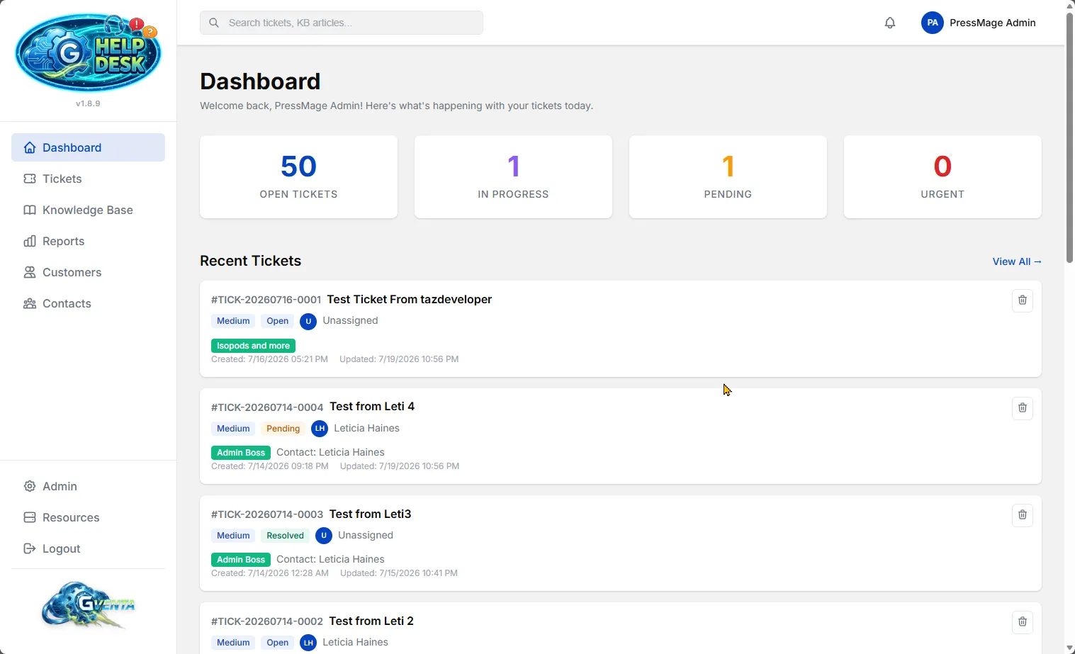 The staff Dashboard: every number is a live link into the Tickets page.
Two panels sit side by side at the top of the page, each with four figures.
| Panel | Figures |
|---|---|
| My Stats | Touched Today, My Open Tickets, My Overdue, My Closed Today |
| Global Stats | Unassigned, Overdue, Urgent Open, Opened Today |
Each figure is color-coded by the status or priority it represents, so an overdue count looks different from a closed count without reading the label.
Every stat is a live link
Clicking any number opens the Tickets page pre-filtered to exactly the rows that produced that count. The filter in the link is generated from the same parameters that computed the number, so the drill-down can never disagree with the headline. If the dashboard says you have four overdue tickets, the page you land on lists those four. Because Tickets page filters live in the URL, you can bookmark or share any of these drill-downs; see Tickets.
The counts are true totals of the filtered results, not the size of the first page, so a figure of 87 means 87 matching tickets even though a list page shows 20 at a time.
Ticket lists
Below the stats are three lists. Each shows the five most recently updated tickets that match its purpose.
| List | Contents |
|---|---|
| My Recent Tickets | Unresolved work assigned to you. |
| Unassigned Tickets | Everyone’s unclaimed, unresolved work. |
| Recently Closed Tickets | Your resolved and closed work. |
Clicking any card opens the full ticket on the Tickets page.
Ticket cards
Each card is a compact summary of the ticket:
- Ticket number and subject.
- Priority badge and status badge.
- Assignee, shown with an initials avatar.
- Customer badge, which is a link through to the customer record.
- Contact name.
- Created and last-updated timestamps.
Source color band
A colored stripe runs down the edge of each card identifying which mailbox the ticket arrived on. Hover over it for a tooltip naming the source. The color for each mailbox is chosen in Settings, Email Integration, and the same band appears on ticket cards throughout the application. If a source has no valid color configured, the band falls back to a neutral gray. See Core concepts for how sources work.
One-click spam
Every card carries a bin icon. Clicking it asks you to confirm, then marks the ticket as spam. Spam tickets leave the working queue immediately, but a copy of the ticket (number, subject, requester, body and source) is retained for the record, and the action is written to the audit log. See Tickets for details.
How the dashboard behaves under load and failure
The dashboard is built so that one slow or broken figure never blanks the whole page.
- Each statistic loads independently. The eight counts are fetched at the same time, and if one fails or is slow, the other seven still appear.
- Each list loads independently. A problem fetching one list affects that panel only; the other two still render.
- Automatic refresh. The notification heartbeat that powers the bell in the top bar re-runs the dashboard’s own filtered queries every 30 seconds, so the numbers and lists stay current without a reload and without ever showing you an unfiltered list.
- Graceful degradation of “my” filters. If your user record cannot be identified for any reason, the “my” panels show everything rather than nothing, so you are never left staring at empty panels.
- Safe colors. Source band colors are checked against a strict
#RRGGBBpattern before use. Anything unexpected is replaced with neutral gray rather than being applied to the page.
Why it matters: Agents open one page and immediately know their workload, their risk, and where the team needs help, with every number clickable straight through to the work itself.
Related pages
- Tickets for the full workspace the dashboard links into.
- Reports and analytics for team-wide trends over time rather than today’s snapshot.
- Settings and administration for choosing each mailbox’s panel color.